iOS 6
iOS 7

Phone
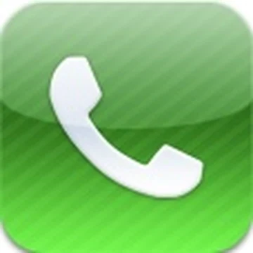
Green has meant “phone” forever. The old one looked shiny and 3D. The new one keeps the green and the shape, but drops the shine. Same idea. Less polish.
When a screen pretends to be something real. Yellow pad, desk calendar, sunflower, camera lens, stack of tickets.
Scott Forstall ran software look in the Jobs years. Touch was new then. Looking like real things helped people know what to tap.
By 2012 phones were normal. Maps had a bad year. Forstall left in late 2012. Jony Ive took the software look. In 2013 the home screen went flat.
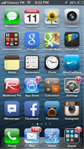
Then Apple made it flat.
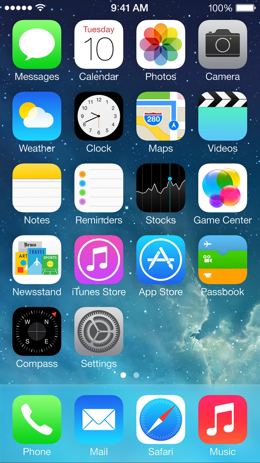
10 June 2013. Apple’s developer conference, WWDC. They didn’t open with a long feature list. They played a film. Jony Ive talked.
“There is a profound and enduring beauty in simplicity, in clarity, in efficiency. True simplicity is derived from so much more than just the absence of clutter and ornamentation. It’s about bringing order to complexity.”Jony Ive · Apple Newsroom · 10 Jun 2013
“We tried to create an interface that is unobtrusive and deferential, one where the design recedes and in doing so actually elevates your content.”Ive · WWDC design film · 2013
Apple’s own site put it shorter: iOS 7 is simple on purpose. They took away the fancy bits. New icons. Thin writing. Blur and glass for depth. Not fake wood.
Craig Federighi showed the swipe-up menu, the app cards, and AirDrop on stage. The look was still Ive’s job.
They showed it in June. You could download it in September. June was “wow” and “weird.” September was “my phone is slow” and “my battery died.”
11 Jun 2013
“iOS 7 looks like it was designed by fairies and unicorns”
@alexburns_
11 Jun 2013
“ios 7 looks like jeremy scott took over apple”
Twitter that week
11 Jun 2013
“omg ios 7 ... cant wait now ... amazing out of this world :)”
@vasseclick
11 Jun 2013
Flat is fine, but I kind of missed the old 3D plastic.
@Mekyzeroone
18 Sep 2013
“Just got iOS 7 👌😁”
@rhayvon_
23 Sep 2013
“ios7 is so much better! What do you guys think? :)”
@AustinMahone · 6k likes
29 Sep 2013
“I love this new Slow Load feature that came with iOS7. Anytime I want slower, all I have to do is open an app.”
@KeahuKahuanui · 200+ likes
2 Oct 2013
CNN listed five common problems after the update. Battery. Freezes. The usual mess.
@CNN
11 Jun 2013
“L'iOS7 c'est vraiment moche pour les messages.”
@Pi0ggia
24 Sep 2013
“iOS7 more like iOS 7% battery left 😒”
@ashjasinski
24 Sep 2013
“decided to update my phone with #ios7 ..it's so slow and such a copy of androids #terrible #apple”
@ginaleehindle
24 Sep 2013
“Everyone complains about how iOS 7 battery sucks but it charges wayyyy faster too”
@SpencerDuhamel
One visual story a week. Icons, maps, old screens, new data. No spam.
Already get The Data Drop? Same list. Nothing double-sends.
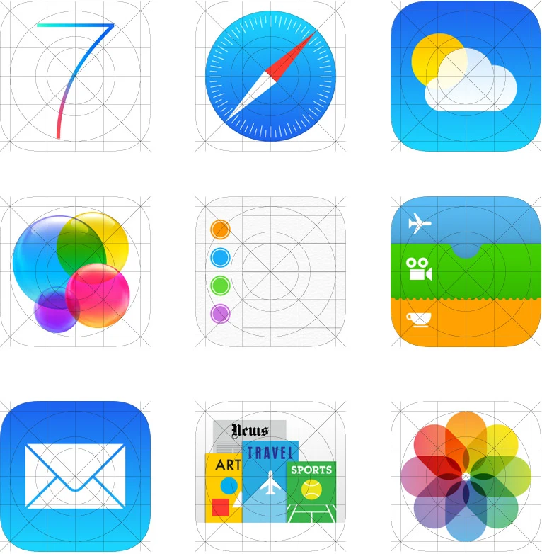
Apple · the new icons
Twenty-six stock icons. Old on the left, new on the right. Scroll through them one by one.
iOS 6
iOS 7
Green has meant “phone” forever. The old one looked shiny and 3D. The new one keeps the green and the shape, but drops the shine. Same idea. Less polish.
iOS 6
iOS 7

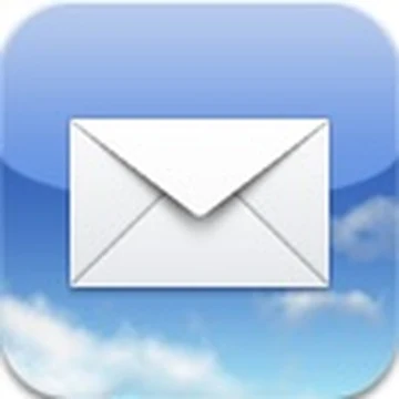
Old Mail sat on a photo of sky. Clouds behind the envelope. New Mail is just a blue square and a white envelope. Still means mail. No outdoor photo shoot.
iOS 6
iOS 7
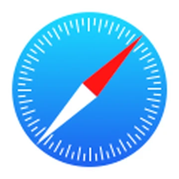
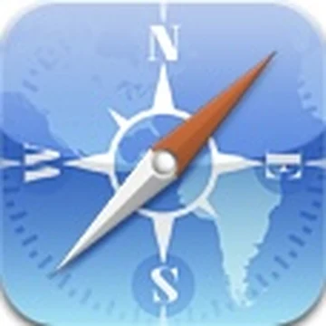
Safari is still a compass for the web. The old one looked like a real gadget you could pocket. The new one is just the dial. Same job. Less jewellery.
iOS 6
iOS 7
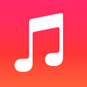
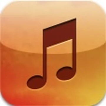
Old Music was orange and chunky. It felt like a little object. New Music is pink and flat. You still open it to play songs. The plastic-player vibe is gone.
iOS 6
iOS 7
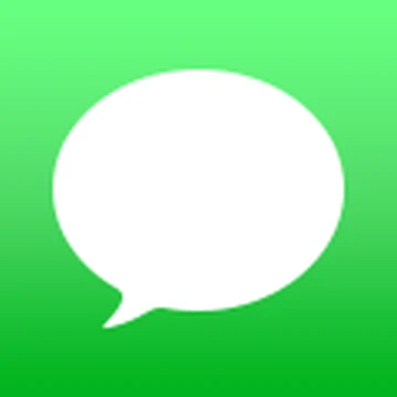
The green bubble still means messages. Old one was shiny like candy. New one is flat. Inside the app, the chat bubbles go flat too.
iOS 6
iOS 7
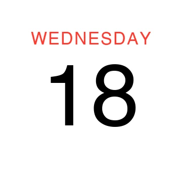
Old Calendar looked like a real desk calendar. Red day stamp. Paper texture. New Calendar is a white square with today’s day and number. The phone draws the real date for you.
iOS 6

iOS 7
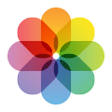
Old Photos was a yellow sunflower. A photo of a flower. New Photos is a rainbow flower. Still “your pictures.” Different drawing.
iOS 6

iOS 7

Old Camera looked like the real lens on the back of the phone. New Camera is a simple grey shape. Still means take a picture. No pretend screws.
iOS 6

iOS 7
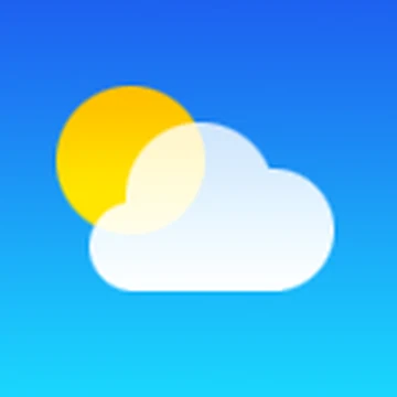
Old Weather put the temperature right on the icon. New Weather is just sun and cloud. Open the app if you want the number.
iOS 6
iOS 7
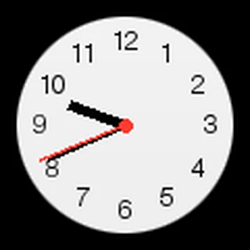
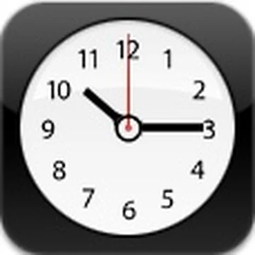
The clock hands still move. That part stayed. Old face looked fancy. New face is simple. Same time.
iOS 6
iOS 7
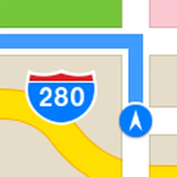
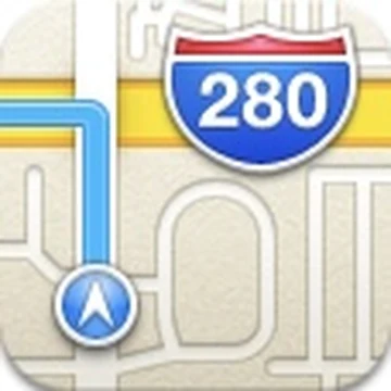
Old Maps showed a road sign. New Maps is a flatter road sign. Maps had a rough year before this. A nicer icon did not fix the maps.
iOS 6

iOS 7

Videos is still a film clapper. Old one looked metal. New one is flat teal. Same meaning.
iOS 6
iOS 7

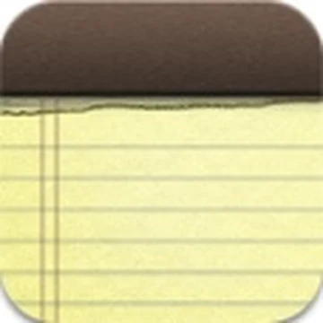
Old Notes looked like a yellow paper pad with a funny font. That was the one people pointed at when they said skeuomorphism. New Notes is still yellow-ish, but simpler. Open it and you get a white page and normal letters.
iOS 6

iOS 7
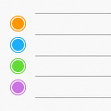
Old Reminders looked like paper on a desk. New ones are a white card with coloured dots. Still a to-do list. Just less stationery.
iOS 6
iOS 7
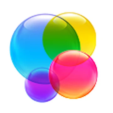
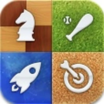
Old Game Center looked like a green casino table. Wood edge. Little game pieces. New one is shiny bubbles. You still get games and scores. No table.
iOS 6
iOS 7

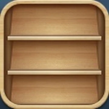
Old Newsstand was a wooden shelf full of magazines. New one is just magazine covers. No shelf. Later Apple removed Newsstand completely.
iOS 6
iOS 7
iTunes Store is still a purple music note. Old one was shiny. New one is flat. Same shop door.
iOS 6
iOS 7
Stocks is still a chart. Old one was blue. New one is black with a white line. Same job. Quieter frame.
iOS 6
iOS 7
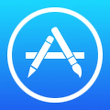
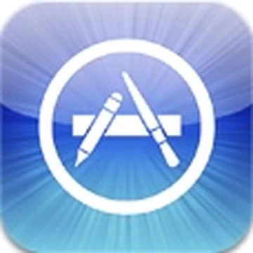
App Store is still a blue A. Old one had sky behind it. New one is flat blue with a pencil. The store is still the store.
iOS 6
iOS 7

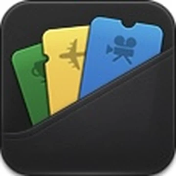
Old Passbook looked like tickets stuffed in a wallet. New one is just the ticket picture. No wallet. Later it became Wallet.
iOS 6
iOS 7

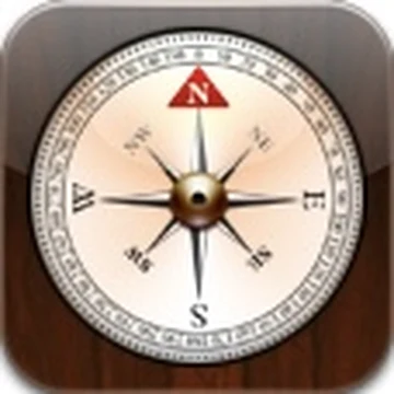
Old Compass looked like wood and brass. New Compass is a black dial. Still points north. Less camping-shop energy.
iOS 6
iOS 7
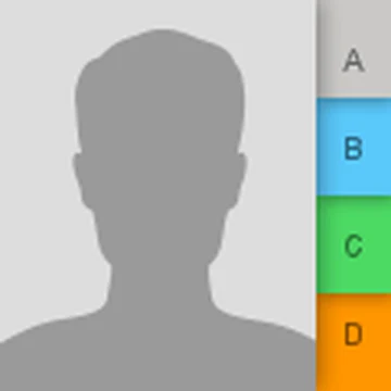
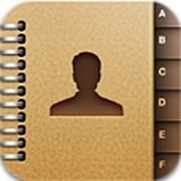
Old Contacts looked like a little address book. New Contacts is a grey person. Still your list of people.
iOS 6
iOS 7
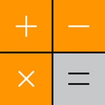
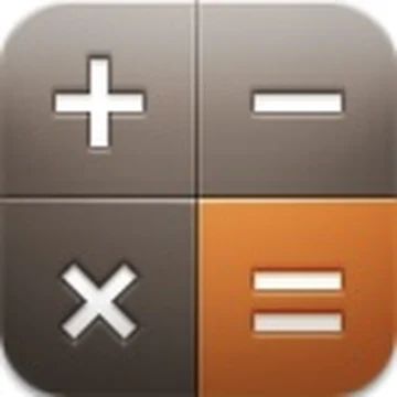
Old Calculator looked like a real plastic one. New one is flat. The orange buttons stay. You still do maths.
iOS 6

iOS 7

FaceTime is still a video camera. Old one looked metal. New one is green and flat. Still means video call.
iOS 6

iOS 7
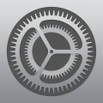
Settings is still gears. Old gears looked like metal. New gears are flat grey. Open it and you get plain white lists.
iOS 6
iOS 7
Old Voice Memos was a microphone. New one is a sound wave. Same app. It still records your voice.
Icons got the attention. The rest of the phone moved too.
Text
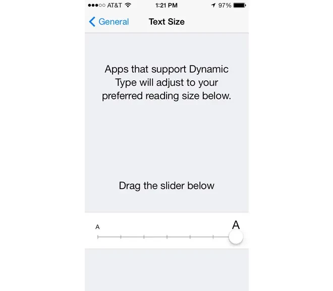
The writing got very thin. Fine on a big stage screen. Outside in the sun, hard to read. Apple made it thicker later.
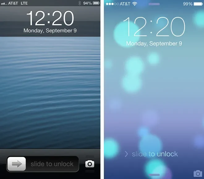
Lock
You used to drag a little bar that said “slide to unlock.” Then you just dragged the whole screen. Camera stayed in the corner.
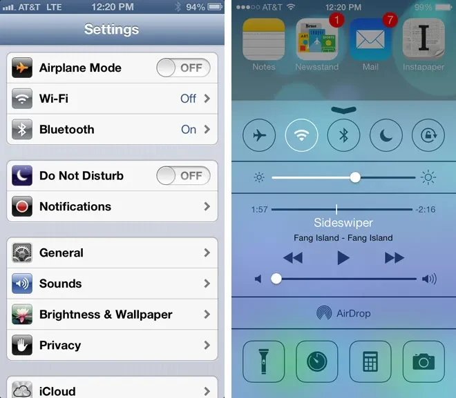
Swipe up
Swipe up from the bottom. Wi‑Fi, brightness, torch, music. Brand new. People loved the torch. For a week some people could peek past the lock. Apple fixed that fast.
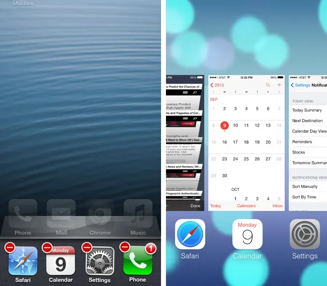
Apps
Double-click home used to show a row of tiny icons. Now you get big cards of open apps. Swipe up to close one. Nice when it worked. Stuck a lot on old phones.
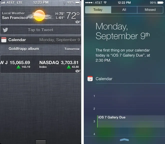
Alerts
Three tabs now: Today, All, Missed. Weather and calendar sit on Today. The old Facebook and Twitter boxes in that menu went away.
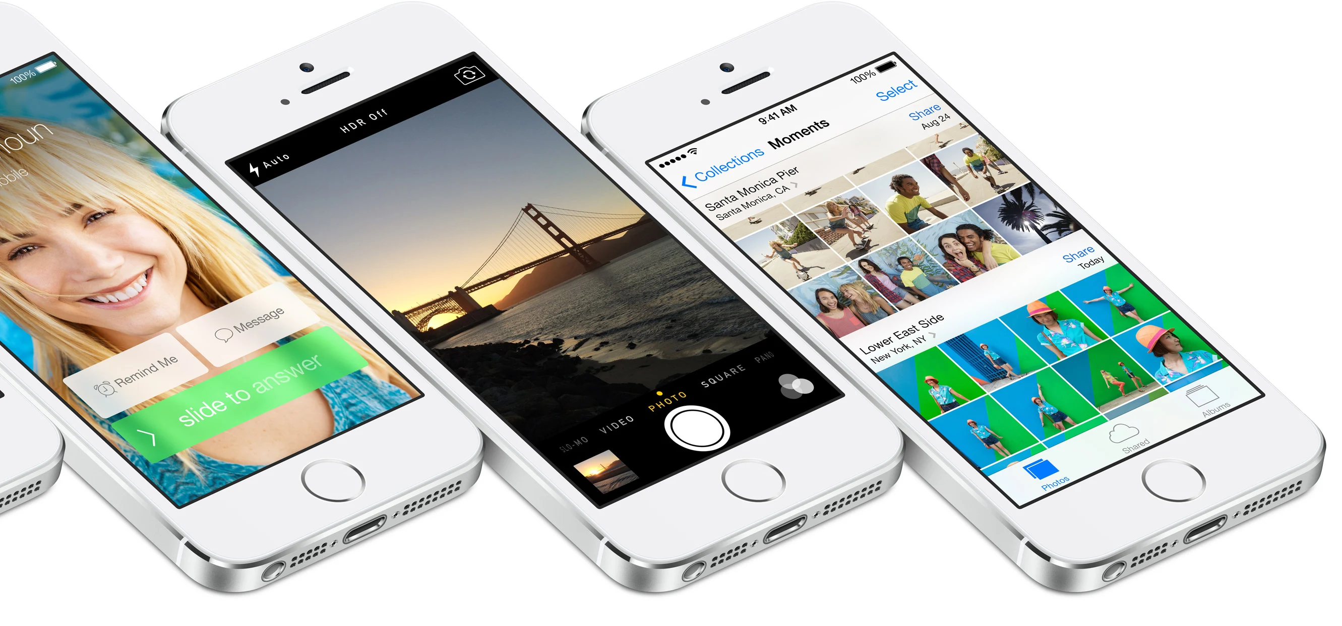
Blur
Bars look frosty. Folders blur what’s behind them. The wallpaper can move a little when you tip the phone. Glass, not fake wood. Older phones got slow.
Old icons had shadows. The dock looked like a glass shelf. New icons sit flat. The dock is a thin frosty strip.
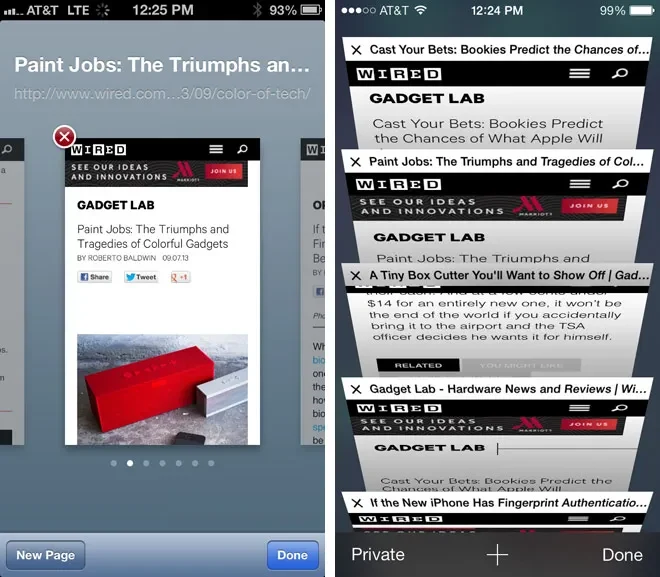
Safari
The web page fills more of the screen. Swipe from the edge to go back. Buttons moved. People had to relearn where stuff was.
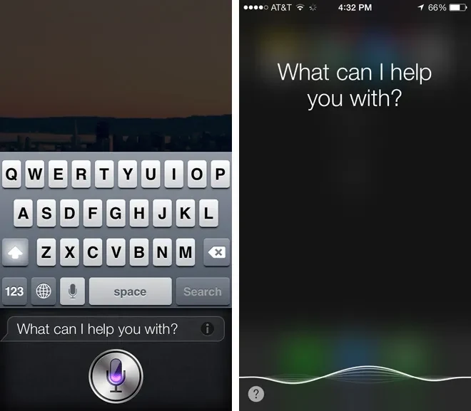
Siri
Siri got a new look. Still wrong half the time. They painted the room. They did not fix the answers.
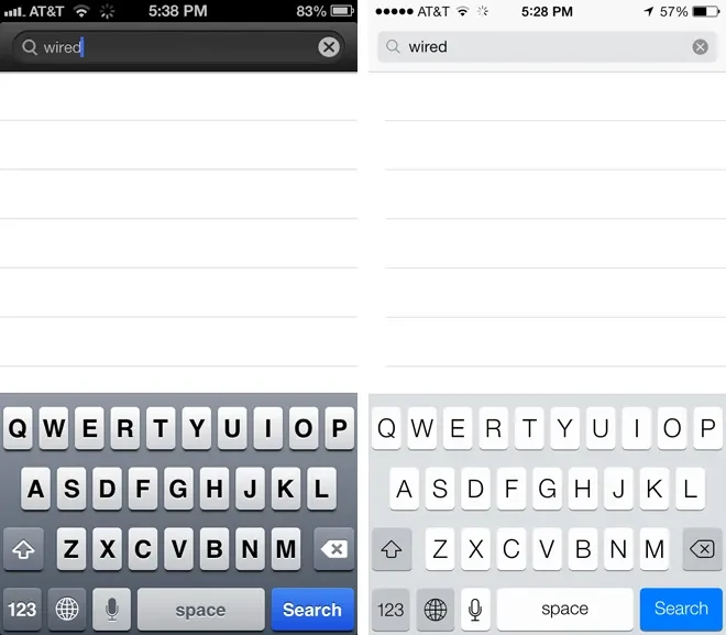
Keyboard
Keys look flat now. Same letters. Some apps still showed the old plastic keyboard for a bit. That looked weird.
The icons were the poster. Here’s what the apps looked like when you actually opened them.
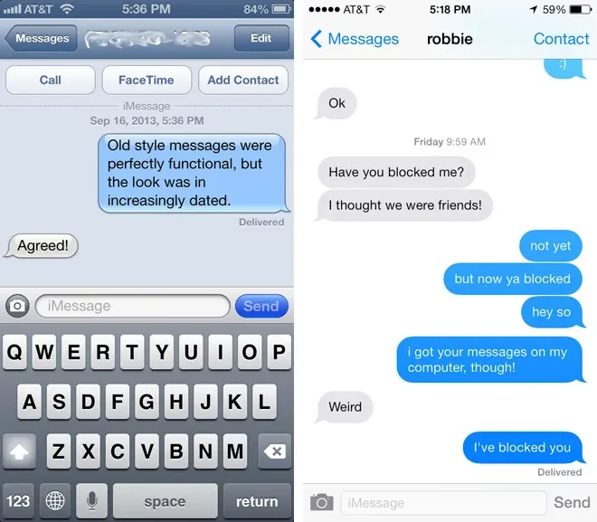
Chat bubbles went from jelly to flat. You still text people the same way.
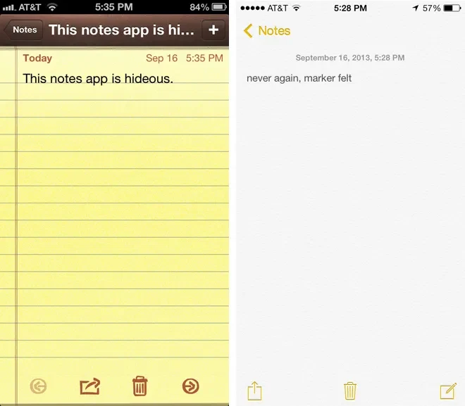
Yellow pad and funny font gone. Plain page and normal letters. This is still the app people joke about.
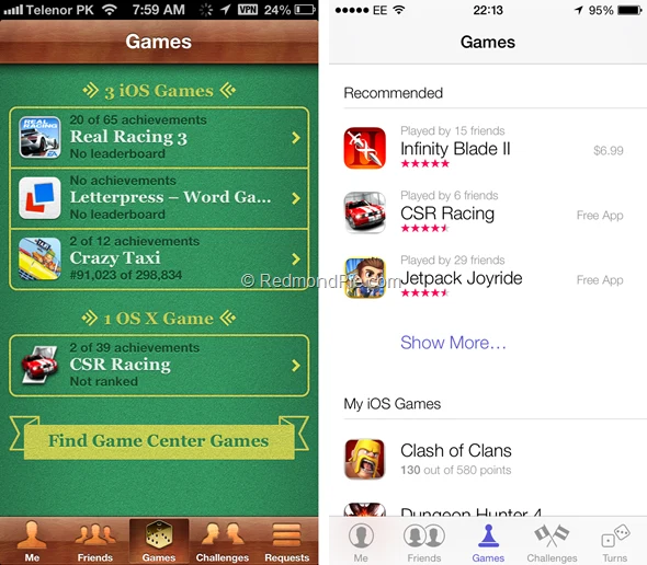
Green casino table gone. Flat screen instead. You still see scores and friends.
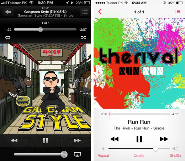
Music player got flatter too. Matches the new pink icon.
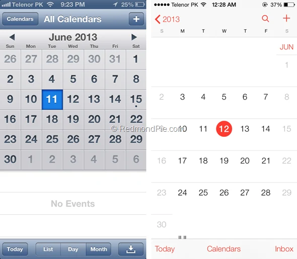
Leather look gone. Red words on white. You still check the month.
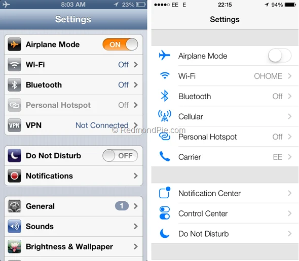
Still a list of settings. No shiny metal bars. No stripey background.
Some do. Not the dead battery. The look.
People still post the old Game Center table like a cute photo. The yellow Notes pad shows up in “remember when” threads. Nobody wants the bad Maps back.
What stuck from iOS 7: flat icons, the swipe-up menu, app cards, blur. Phones still use those ideas. They do not put casino felt back on the home screen.
So people miss the funny old icons. Not the whole old phone.
Drop your email. Next week’s essay lands free.
Keep walking · four more rooms · all drops
The ones I really disappear into live in the Hidden Tab. Members only, three a week, and they never come out here.
Into the Hidden Tab →